Dysport Therapeutics developed this dosing guide to give physicians a comprehensive tool for determining patient dosage. Based on patient weight, the guide featured slide-out panels on each side that presented critical dosing information in a dynamic, user-friendly format.
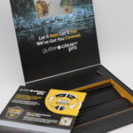
Alu-Rex used this dynamic kit to showcase the benefits of its Gutter Clean Pro system. Featuring dual-layer technology, Gutter Clean Pro is designed to keep water flowing freely, block debris, and deliver reliable performance year after year. Inside the kit, recipients found product information, an interactive wheel highlighting different weather conditions paired with the right solution, and an actual sample of the product.
Moosehead Breweries used our telescoping design to introduce the new packaging of its’ classic Alpine Lager brand. The self mailer looks like an ordinary mailer on the outside but as you pull up on the tab, each panel expands and locks while an image of the new beer bottle builds with each pull and the final image is revealed at the end. Nothing ordinary about it!
SaskTel used our Telescoping Folder to showcase how its data services deliver reliable connectivity across different scenarios. Each of the four panels highlights a unique use case, creating a clear, engaging story. With every pull, a new panel is revealed—maximizing content space—while still mailing in a standard-size envelope.
Biogen utilized this reference guide to educate physicians about SKYCLARYS®. The guide features four slide-out tabs on each side that lock into place, with each tab presenting distinct information and physician testimonials.
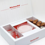
KitchenAid® sent this kit to influencers nationwide to help them guess the Color of the Year. Inside, recipients found branded mugs and a curated herb collection designed to inspire clues about the new color. Influencers were encouraged to share their best guess on social media and tag KitchenAid Canada in their posts.
BASF leveraged our automated Iron Cross Mailer to introduce Nurizma® insecticide through a highly engaging direct mail experience. The unfolding format created a natural sense of momentum, guiding recipients through the product’s key features while maximizing visual impact. Because the design is fully automated, it eliminates the need for hand assembly—delivering meaningful production efficiencies and strong cost savings. This makes it an ideal solution for marketers seeking high-impact execution and a measurable lift in ROI, even with tighter budgets.
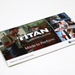
Kruger PRO used our Slider design to introduce its new line of Titan® Wipers & Cloths in a highly intuitive way. The piece simplified product selection by incorporating a slide chart that guided end-users to the best solution for their specific needs. As the right-hand panel was pulled, a different need appeared at the top, with the corresponding product solution revealed beneath it. A mylar window provided a preview of additional needs and solutions, encouraging interaction while giving recipients a clear, at-a-glance understanding of the full product range.
Biohaven Pharmaceuticals used this starter kit to introduce patients to Nurtec™ ODT and to get patients started on their Patient Support Program. The kit was housed inside an outer sleeve. When you pull the kit out from the inside, there is a folder that carried a sample pack and additional literature. The sample pack could be easily lifted out by pulling up on the lift tab.
Roundup used our pop-up cube to introduce their new Roundup Xtend weed control product.